
Together for Europe – Movement for the European Federal Union is happy to announce the launch of its new visual identity, which includes an updated logo and a revamped web presence. This marks another major milestone in the ongoing process of revitalizing our movement, following a series of initiatives started earlier this year.
The redesigned logo and website reflect our renewed commitment to clarity, accessibility, and a seamless user experience. The website has been restructured to improve navigation, making it easier for visitors to explore our content, engage with our initiatives, and follow our publications.
Our website remains accessible at https://togetherforeurope.com, where users can learn more about joining our movement or staying informed on our latest activities.
The Creation and Design of the Together for Europe Logo
The Together for Europe logo is a visual embodiment of the principles and aspirations of our movement, deeply rooted in the values expressed in the Rome Manifesto. Central to the design is a flame, a timeless symbol of guidance, hope, and the future. It represents the idea of “passing the torch” from one generation to the next, lighting the way forward for a united Europe.
The Flame’s Symbolism
The flame serves as a beacon, guiding us toward a brighter, more unified future. It embodies the hope that we carry for the next generation, ensuring that the values of cooperation, peace, and solidarity are passed on. The flame stands as a reminder that this future is not just built by a single entity, but by many hands, coming together in a shared vision.
The Mosaic Design: A Reflection of Diversity
The flame itself is constructed from a mosaic of triangular pieces, a deliberate design choice that reflects the diversity of the people who make up Europe. Each triangle represents an individual, a community, or a culture—different in its shape and color, yet essential to the whole. If you zoom out, these seemingly separate pieces form a united and cohesive picture, symbolizing the strength that comes from Europe’s rich diversity.
This mosaic concept is directly inspired by the Rome Manifesto, which emphasizes unity through diversity. Just as the manifesto calls for solidarity among nations, our logo visually represents the many distinct cultures, languages, and traditions that make up Europe, coming together to form something greater than the sum of their parts.
The Earthy Color Palette
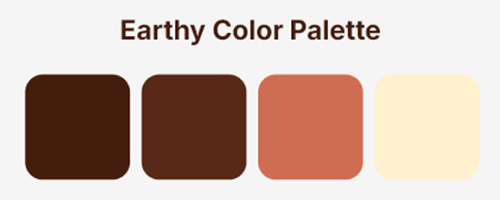
To further reinforce this connection to the land, to history, and to the people, we opted for an earthy color palette. These natural tones are closely linked to Europe’s landscapes, cultures, and heritage, providing a sense of warmth and grounding,with an extra hint of blue (at the website) that represents the sea.
We intentionally avoided the dark blue commonly associated with the European Union’s visual identity. This choice reflects our desire to distinguish ourselves visually and to emphasize that Together for Europe is a grassroots movement, built from the ground up by diverse communities, not defined by political institutions.
In its entirety, the Together for Europe logo encapsulates our vision of unity, diversity, and the hope for a brighter future. It invites all who see it to join us in shaping the Europe of tomorrow—a Europe built on shared values and a common purpose, yet vibrant in its diversity.